
Make An AI Website Look Less AI-Generated
A less AI-generated website is usually more specific, better ordered and more connected to the real business behind it.
To make an AI website look less AI-generated, focus on specificity rather than decoration. Improve the page structure, rewrite vague copy, adjust typography and spacing, use more relevant imagery, add real brand detail and make the conversion path clearer. The goal is not to hide that AI helped. The goal is to make the website feel like it belongs to the business.
A site looks obviously AI-generated when it feels too smooth, too broad and too similar to other sites. You can often fix that without rebuilding everything, but the work needs to be guided by the customer journey, not by random visual tweaks.
Start with the first impression
The first screen should tell visitors what the business does, who it helps and why they should keep reading. Many AI-built sites start with a broad statement that sounds impressive but does not anchor the visitor. If the headline could fit hundreds of companies, the design will feel generic even if the page is visually tidy.
Rewrite the hero around a real offer or problem. Add a short supporting line that explains the context. If the business serves a specific industry, location or customer type, say so where it helps. A clearer first impression can make the same design feel more human immediately.
Reduce the default AI layout feel
AI-generated layouts often rely on symmetrical cards and repeated section blocks. The page can become visually predictable: headline, three cards, headline, three cards, CTA, FAQ. Predictability is not always bad, but too much of it makes the site feel assembled from defaults.
- Vary section depth where the message needs more explanation.
- Give important content more visual weight than supporting content.
- Remove cards that exist only to fill a grid.
- Use comparison, process or proof sections when they suit the decision.
- Let some sections breathe instead of forcing every point into a box.
If the layout also has technical or usability issues, treat that separately through website repair. A design polish pass should not hide broken forms, poor mobile behaviour or confusing navigation.
Make typography and spacing feel intentional
Typography is one of the quickest ways to spot an unedited AI design. Very large headings, loose spacing and repeated card titles can look dramatic in a preview but tiring on a real business site. Check whether the type scale helps the visitor scan or simply makes everything loud.
Spacing needs the same judgement. AI designs can be too airy on desktop and too long on mobile. They can also stack cards with identical spacing until the page loses rhythm. Tighten sections that repeat, add breathing space where decisions matter and make sure headings do not leave awkward single-word lines on desktop.
Use colour as brand direction, not decoration
Gradients, glowing accents and dark panels are common in AI-built sites. They can look polished, but they should support the tone of the business. A financial adviser, a trades firm, a software product and a repair specialist should not all feel like the same tech landing page.
Choose a smaller set of colours with a job: background, text, accent, trust signal, warning or action. If every card has a glow, no card has priority. If every section is high contrast, the visitor has no rest. Design repair is often about restraint.
Replace generic imagery with useful context
Stock-style imagery can make an AI website feel artificial. Abstract office shots, floating devices and vague technology scenes rarely tell the visitor anything useful. Better imagery does not have to be expensive, but it should connect to the work, audience, process or outcome.
Use images only where they clarify. For some service businesses, clear process visuals, real location cues or product detail will work better than glossy mood images. For others, the right answer may be fewer images and stronger copy. Do not add images in this repair pass unless the image workflow is part of the task.
Rewrite copy so it sounds like the business
The copy is usually where the AI-generated feel becomes most obvious. Phrases such as tailored solutions, seamless experiences and unlocking potential are not wrong, but they are weak if they replace real detail. Visitors trust specificity: what you fix, how you work, who you help, what problems you avoid and what happens after they enquire.
If AI wrote the first draft, keep useful structure but add human judgement. Replace broad claims with examples. Turn abstract benefits into practical outcomes. Say what you do not do where that helps qualify enquiries. If search visibility is also a concern, review AI-generated content SEO problems before rewriting only for style.
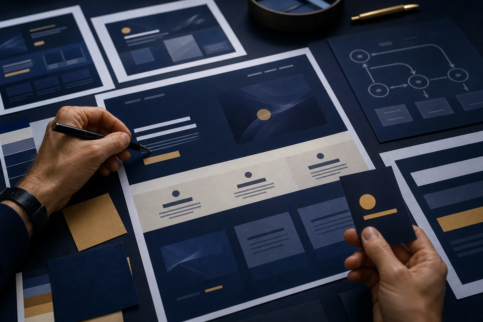
Improve CTAs and the conversion path
A common AI pattern is to add buttons everywhere without asking whether the visitor is ready. The best CTA depends on the page. Some visitors need to see process and proof before they send an enquiry. Others need a quick route because they already know the problem.
Make the main action visible, but do not let it replace persuasion. A better conversion path may include clearer service sections, stronger trust signals, a practical next-step explanation and a form that asks for the right information. For AI-built sites that look complete but need confidence before launch, Fix AI Website Design is the natural review point.
What not to overdo
Do not try to make the site less AI-generated by adding visual noise. More animation, more colours, more icons and more sections can make the site feel even more artificial. The strongest fix is usually clearer thinking expressed through simpler design.
Also avoid changing every page at once. Start with the homepage or the main service page, then carry the improved direction across the rest of the site. If every page is rebuilt separately by AI, the site can become inconsistent instead of distinctive.
Checklist to make an AI website feel less AI-generated
- Rewrite the hero around a specific service, audience or outcome.
- Remove duplicate feature cards and repeated claims.
- Adjust heading sizes and spacing for real reading, not preview drama.
- Choose colours and fonts that fit the business tone.
- Replace vague images with useful context, or remove them.
- Add real process, proof, examples or constraints.
- Check mobile rhythm, especially long card stacks.
- Make the CTA match the visitor’s level of confidence.
When editing is enough
Editing is enough when the site has a workable foundation. If the pages are organised, the service offer is clear and the main weakness is generic presentation, targeted improvements can make a real difference. You can keep the useful parts and bring the site closer to the business.
When professional review is needed
Get a professional review when you are no longer sure whether the problem is design, copy, SEO, code or the whole structure. That is the point where repeated prompting can waste time. A practical review can decide whether to improve, redesign or rebuild before more effort goes into the wrong direction.
Use real constraints to make the design more believable
AI-generated sites often sound as if everything is possible, simple and seamless. Real businesses usually have clearer boundaries. They know which jobs are a good fit, what information they need, what can go wrong and what customers should expect. Adding those constraints can make the website feel more human and more trustworthy.
For example, a service section can say what is included, what is not included and when a different option is better. A CTA section can explain what happens after enquiry. A process section can name the decisions that are made during review. These details make the design feel less like a demo and more like a working business site.
Check consistency across deeper pages
The homepage may be the obvious place to start, but an AI-generated feel often returns on deeper pages. Service pages, blog posts and comparison pages may use different tones, repeated headings or mismatched CTA wording. A visitor who clicks through can feel the site losing confidence.
After improving the main page, check the rest of the journey. The site should feel like one business with one clear point of view, not several generated drafts stitched together.
Make The Site Specific Before Adding More Polish
Making an AI website look less AI-generated is not about pretending AI was not used. It is about adding the missing business judgement. Clearer positioning, better hierarchy, stronger copy, more relevant visuals and a cleaner enquiry path can turn a generic generated site into something much more credible.