
Why AI Websites Look The Same
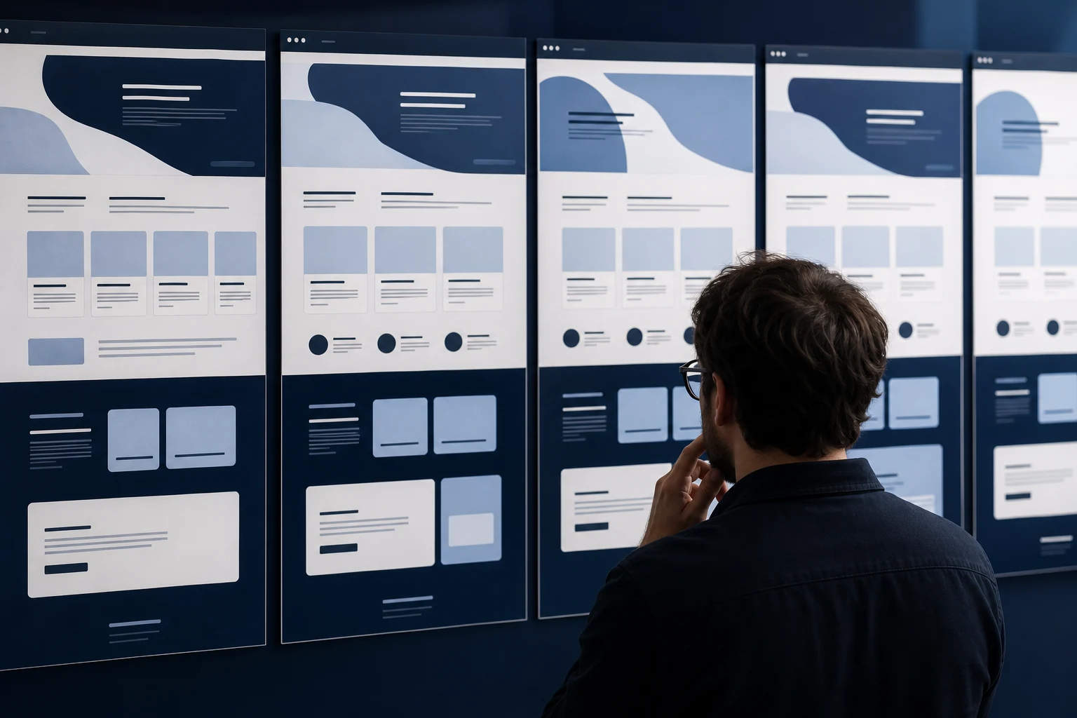
AI websites often look the same when common defaults replace brand, service and customer-specific decisions.
AI websites often look the same because many tools reach for the same safe design patterns when they do not have enough specific brand, audience and service input. They produce a modern-looking page, but modern can become forgettable when the layout, typography, colours, cards and copy all come from common defaults.
This does not mean AI tools are bad for website building. They are useful for speed, structure and early ideas. The sameness appears when the generated design is treated as finished instead of being shaped by real business judgement.
AI tools often choose familiar page patterns
Most generated sites start with recognisable website ingredients. There is a hero section, a benefit row, a feature grid, a process section, a testimonial area and a contact call to action. Those pieces are not wrong. A human designer may use the same ingredients. The issue is how little hierarchy and specificity the first AI version often contains.
When every section looks equally important, the visitor has to work too hard. The design does not guide attention. It simply presents a neat stack of content. That is why two AI-built sites in completely different industries can feel oddly similar, even when their words are not identical.
Training examples and safe defaults push sites toward the middle
At a high level, AI tools learn from patterns that appear often. Common website examples naturally influence the kind of structure they produce. When the prompt asks for a modern website, the tool tends to choose the broad version of modern: clean cards, soft gradients, simple icons, short sections and confident but general wording.
That middle ground is useful when you need a first draft. It is weak when you need a website that represents a real business. The more generic the prompt, the more likely the result is to look like other generated sites.
Generic prompts create generic visual decisions
A prompt such as “build a professional website for my consultancy” leaves too much open. The AI has to guess the audience, tone, proof, services, objections, buying journey and brand personality. To avoid being wrong, it often chooses safe design decisions. Safe decisions can quickly become bland decisions.
- Default colour palettes rather than colours with meaning.
- Broad service cards rather than a clear service hierarchy.
- Abstract imagery rather than work, process or customer context.
- Generic CTAs rather than actions matched to buyer readiness.
- Vague benefit statements rather than useful proof or examples.
If the same weak input goes into different tools, the outputs may vary in polish but still feel similar. Stronger inputs create stronger differences.
Component libraries make repetition more visible
Many AI website builders use component patterns because components are fast to assemble. Cards, tabs, accordions, split sections and icon grids are efficient. They also become obvious when every business uses them in the same order with the same level of detail.
The answer is not to avoid components. The answer is to make each component earn its place. A feature card should say something specific. A process step should reduce uncertainty. A testimonial or proof section should help the visitor believe the claim. If the component does not do a job, it becomes decoration.
Typography and colour defaults add to the sameness
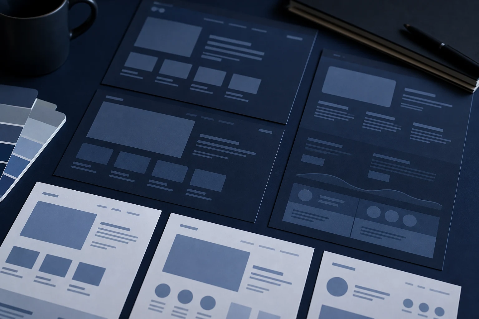
AI-generated sites often use the same visual language: large geometric headings, lots of dark or gradient backgrounds, bright accent colours, glass-style cards and generous rounded corners. None of these choices are automatically wrong. The problem is using them without a brand reason.
Typography should help the site feel appropriate for the business. A serious repair service, a local trade, a legal firm, a creative studio and a software product should not all have the same visual temperature. If the design ignores that, the site may look polished but emotionally flat.
Lack of brand input is the real cause
The most distinctive websites usually have enough raw material: clear positioning, customer problems, service detail, proof, tone, constraints, examples and priorities. AI cannot invent those responsibly from nothing. It can arrange and polish what it is given, but the site owner still needs to decide what the business stands for and what the visitor should understand first.
If your site looks too similar to others, review it through Fix AI Website Design before asking for another generated redesign. A better brief and a sharper repair pass can often keep the useful structure while making the site feel more like the business.
Why “modern” can still mean forgettable
Modern website design is often described in surface terms: clean, minimal, responsive, premium, sleek. Those qualities can help, but they do not guarantee trust. A visitor does not choose a business because the cards are rounded. They choose because the site makes the offer clear, answers doubts and gives them confidence to take the next step.
A generic AI website may look current without being persuasive. That is why design repair should include copy, information order and conversion flow, not just visual styling.
How to break out of sameness
Breaking out of sameness starts with decisions. Decide what the page should make clear first. Decide which customer doubts matter most. Decide what proof belongs above the fold and what can wait. Decide which design elements support the brand and which are only there because the tool added them.
- Rewrite the prompt or brief around the real audience and offer.
- Replace generic benefit cards with specific service or outcome cards.
- Use colour and type choices that fit the business tone.
- Move trust signals closer to the point where visitors need reassurance.
- Remove sections that repeat the same message.
- Check the mobile layout, because sameness often becomes more obvious in a long card stack.
When the issue overlaps with AI-generated copy, the design may also need an AI-generated content SEO review. Repeated wording can weaken both distinctiveness and search intent.
Checklist for understanding why your AI site looks the same
- Was the original prompt specific about audience, services and proof?
- Could the hero headline be used by a competitor with little editing?
- Are the colours and fonts chosen for the brand, or just because they look modern?
- Do several sections repeat the same claim?
- Are icons and images clarifying the offer or filling space?
- Does the site show real process, examples or credibility?
- Does the mobile version feel like one long list of similar cards?
Improve, redesign or rebuild?
Improve the site if the structure is usable and the problem is mostly lack of specificity. Redesign it if the order, visual direction and journey are too generic. Rebuild it if the underlying pages are so thin or inconsistent that repair would take longer than creating a cleaner foundation.
If you are deciding between those options, a broader AI website builder check can help you see whether the sameness is only visual or part of a wider readiness problem.
The sameness is usually clearest in the middle of the page
People often focus on the hero, but the middle sections are where AI sameness becomes most visible. This is where generated sites tend to use three benefits, three process steps, three reasons to choose us and three more cards that repeat the same promise. The page looks balanced, but the information value is low.
Review those middle sections carefully. Each one should either answer a buyer question, explain a service, remove a doubt or move the visitor closer to action. If a section only exists because landing pages usually have that kind of block, it is probably contributing to the samey feel.
Distinctive does not have to mean unusual
A distinctive business website does not need strange layouts or experimental visuals. It needs choices that fit the business. A plain page with specific copy, useful proof and clear hierarchy can feel more distinctive than a flashy generated design that says very little.
The safest way to break out of sameness is to become more precise. Use the customer’s language, show the real service shape, explain what happens next and remove sections that could belong to anyone.
Breaking Out Of The Same AI Website Pattern
AI websites look the same when the tool is asked to solve brand, design, copy and conversion decisions without enough business input. The way out is not to reject AI. It is to use AI as a start, then make deliberate decisions about what the site needs to say, show and prioritise.