
AI Website Design Review: What To Check Before Launch
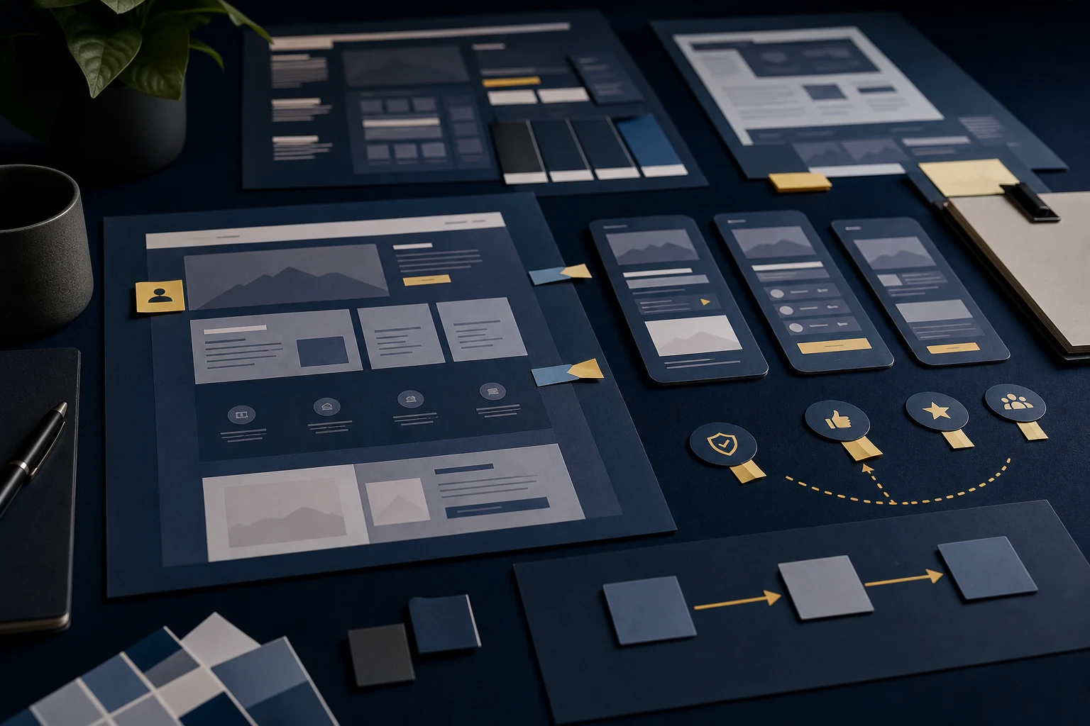
An AI website design review checks first impression, brand fit, mobile flow, trust and whether the site is ready to launch.
An AI website design review checks whether an AI-built site is clear, trustworthy, mobile-friendly and ready for real visitors before launch or before more redesign work. It looks at first impression, brand fit, layout, copy, trust signals, calls to action and whether the site should be improved, redesigned or rebuilt.
This kind of review is useful when a website technically exists but you are not sure whether it feels credible enough to represent the business. It turns a vague concern into a practical list of what to fix next.
First impression
The first impression review asks what a visitor understands immediately. The site should make the offer, audience and next step clear without forcing people to decode broad AI-written claims. If the hero section is attractive but vague, the site may feel generic before the visitor reaches the useful content.
A good first impression does not need to explain everything. It needs to create enough confidence for the visitor to continue. That usually means a specific headline, useful supporting copy, clear visual priority and a CTA that fits the page.
Brand fit
Brand fit is not about adding a logo to a generated layout. It is about whether the tone, typography, colour, imagery and content choices match the business. A serious service business should not feel like a generic tech demo. A creative business should not feel like a default SaaS template unless that is genuinely appropriate.
The review checks whether the design has a reason behind it. If the visuals are attractive but disconnected from the offer, the site may need stronger direction rather than more decoration.
Layout and hierarchy
AI builders often produce neat layouts, but neat is not the same as persuasive. The review checks whether important information appears at the right time and whether each section has a clear job. Visitors should not have to read every card to understand the service.
Good hierarchy helps people skim. It makes the main offer obvious, gives support to secondary details and prevents repeated sections from feeling like filler. When hierarchy is weak, AI website design repair can improve the site without guessing at random visual changes.
Mobile experience
The mobile review is essential because AI-built desktop previews can hide problems. A design may look spacious on a large screen but become a long stack of similar cards on a phone. Headings may wrap badly, buttons may crowd the copy and forms may feel heavy.
- Check that headings fit without awkward clipping.
- Make sure cards stack with enough rhythm.
- Confirm buttons stay readable and tappable.
- Check that form fields and textareas fit the viewport.
- Look for repeated sections that become tiring on mobile.
If the mobile version feels weaker than desktop, do not launch until it has been reviewed properly.
Copy quality
Copy quality is one of the strongest signals in an AI website design review. Vague copy makes the whole site feel generated. Specific copy makes even a simple design feel more credible. The review checks whether the wording names real services, real customer situations, process detail and reasons to trust the business.
It also checks whether pages are trying to rank for useful search intent or simply repeating broad claims. For content-heavy issues, AI-generated content SEO problems may need to be reviewed alongside design.
Trust signals
Trust signals should appear where visitors need reassurance. That might include process explanation, examples, credentials, guarantees, service boundaries, case detail, realistic next steps or contact clarity. AI-generated sites often include trust sections, but the content inside them can be too general.
A design review asks whether the proof would persuade a cautious buyer. If the answer is no, the site needs better substance, not just a nicer testimonial block.
Calls to action
CTA review checks whether the page gives visitors a clear and sensible next step. Some AI-built sites add too many buttons with the same wording. Others hide the action until the bottom. The right answer depends on the buyer journey.
The CTA should match the confidence the page has built. If the site asks for contact before explaining the service, visitors may hesitate. If the site explains everything but never asks clearly, visitors may drift. A stronger conversion path balances both.
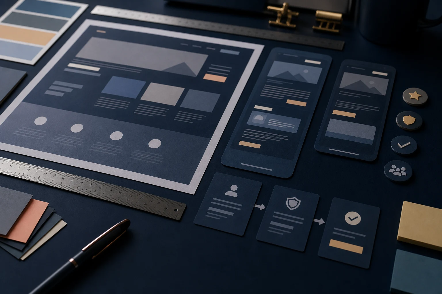
Whether the design is repairable
Not every AI-built design needs a rebuild. A review should identify whether the site can be improved with targeted changes or whether the foundation is too weak. This is where repair, redesign and rebuild become practical options rather than vague preferences.
- Improve if the structure works but needs stronger detail.
- Redesign if the concept is sound but the visual direction and journey are generic.
- Rebuild if the pages are thin, inconsistent or difficult to turn into a proper business site.
For wider launch readiness, an AI website builder check can review design alongside SEO, content, forms and repairability.
What happens after review
After review, you should have a clear list of issues and a sensible order of work. That might be a focused copy and hierarchy pass, a mobile spacing fix, a stronger service page structure, a design refresh or a full rebuild recommendation. The point is to stop guessing.
If the site was built through ChatGPT Work, the review may also connect to ChatGPT Work website repair where design, content and build quality need to be checked together.
AI website design review checklist
- Does the first screen explain the real offer?
- Does the design fit the business tone?
- Are sections ordered around the visitor’s decision?
- Does the mobile version feel as deliberate as desktop?
- Is the copy specific enough to build trust?
- Are proof and reassurance visible at useful points?
- Do CTAs match the visitor’s readiness?
- Is the site best improved, redesigned or rebuilt?
Review the site against real visitor questions
A strong design review is not just a designer looking at whether the site is attractive. It should be checked against the questions a visitor brings to the page. What is this? Is it for me? Can I trust it? What do I get? What happens if I enquire? Why this business rather than another one?
If the design does not help answer those questions, it needs improvement. Sometimes the answer is better copy. Sometimes it is stronger hierarchy, clearer service cards or a more visible proof section. The review should connect the visual issue to the visitor’s decision.
Check whether the AI draft has hidden repetition
AI-built pages often repeat themselves in ways that are easy to miss during editing. A benefit section, process section and FAQ may all say the same thing in slightly different language. This makes the site longer without making it more persuasive.
During review, group similar claims together and ask whether each section adds something new. If it does not, merge it, rewrite it or remove it. A shorter page with clearer priorities usually feels more professional than a long page of repeated generated confidence.
What a useful review output should include
The output should be practical. It should name the main issues, explain why they matter and separate quick fixes from larger structural decisions. A vague note that the site needs more personality is not enough. The business needs to know whether to rewrite the hero, change the section order, improve mobile spacing, add trust detail or consider a redesign.
It should also identify what not to change. Preserving working forms, useful URLs and strong existing copy is just as important as spotting weak design.
Use The Review To Choose The Right Next Step
An AI website design review is a practical checkpoint before launch or redesign. It helps you see whether the site is merely complete or genuinely ready to represent the business. The output should be a clear repair path, not another round of uncertain design changes.