
Hostinger Mobile and Layout Problems? What to Check

Hostinger layout problems can show up as awkward mobile views, poor desktop width, blurry images, broken spacing or sections that do not feel trustworthy.
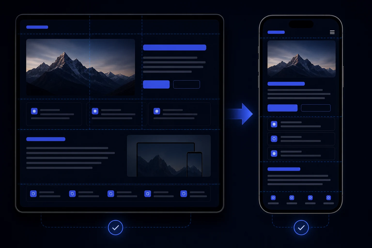
Hostinger layout problems are not only mobile problems. A site may feel cramped on a phone, too narrow on desktop, oddly spaced on larger screens, or visually weaker because images look blurry after upload. The page can technically load and still feel untrustworthy.
Start by testing real screen sizes. The builder can make a layout look acceptable in one view while the published site feels awkward on the devices customers actually use.
What the problem looks like
Symptoms include headings wrapping badly, buttons feeling too wide or too small, forms becoming hard to use, desktop content sitting in a narrow column, wide unused space, sections that stretch awkwardly, images looking compressed, or product/service blocks becoming tiring to scan.
If the layout issue appeared after publishing, connect it with Hostinger published-site checks rather than assuming the design itself is the only cause.
Specific likely causes
Likely causes include responsive section settings, image dimensions, uploaded image quality, cropping, spacing choices, desktop width constraints, builder limitations, too much AI-generated copy in one section, or form/buttons that were not tested on real phones.
Blurry images can come from small source files, heavy compression, stretching a crop into the wrong space, or using images that do not match the section. Trust drops quickly when a business website looks visually soft or misaligned.
What to check first
Check the homepage, service pages, contact form and footer on a real phone and a desktop browser around 1440px wide. Look for horizontal overflow, clipped sections, odd margins, poor image quality and buttons that feel awkward to tap. Then check whether the same issue appears in another browser.
If the layout is damaging the enquiry route, fold it into the wider Hostinger AI website repair review so the fix improves conversion, not just spacing.
What not to do
Do not shrink every heading globally to hide one bad wrap. Do not replace images blindly without checking dimensions and crop. Do not add more sections to compensate for weak structure. A longer page with the same layout problem usually feels worse on mobile.
Avoid solving desktop width by forcing everything full-screen. Some sections need constraint; the problem is whether the content uses the available space naturally and reads well.
When to stop editing and get help
Stop when each layout tweak breaks another screen size, when mobile form usability is weak, when desktop feels obviously constrained, or when image quality cannot be fixed by simple replacement. That suggests the issue is structural rather than a single spacing setting.
If the visual problem is also making the site look generic, review Hostinger AI website looks generic issues at the same time.
Practical checklist
- Check mobile hero, menu, buttons and forms.
- Check desktop width and section spacing.
- Review image source dimensions and crop.
- Test another browser.
- Look for horizontal overflow.
- Check product/service cards.
- Review form labels and submit button.
- Confirm visual quality supports trust.
Extra layout checks on real screens
Check the page as a visitor would read it, not just section by section. On mobile, the order of information matters as much as visual fit. If proof, service details or the contact route appear too far down the page, visitors may leave before the useful content appears. On desktop, a site that sits in a narrow column or leaves large unused space can feel unfinished even if it is technically responsive.
Image quality deserves its own pass. Look at whether images are too small for their containers, cropped awkwardly, stretched across desktop sections or compressed enough to look soft. Poor images can make an AI-built site feel less credible, especially for trades, ecommerce, consultants and local services where trust is built quickly from visual detail.
Finally, test forms and ecommerce blocks inside the layout. A page can look acceptable until a visitor reaches the form, product grid or checkout step. Those are the places where spacing, button size and mobile readability affect real business results.
Why desktop width matters too
Many layout reviews focus only on mobile, but desktop width can also make a Hostinger site feel unfinished. If content is trapped in a narrow column, if cards do not use space naturally, or if large sections have awkward empty areas, visitors may read the site as builder-made rather than carefully prepared.
Desktop repair does not mean stretching every section. It means giving text, cards, images and forms enough room to breathe while keeping lines readable. The best result feels intentional on both laptop and phone, with no layout that looks like it belongs only in the editor preview.
Check the footer and navigation as well as the hero. Mobile visitors often use the menu, footer links or contact details when they are ready to act. If those areas are cramped, hidden or hard to tap, the page can lose enquiries after the main content has already done its job.
Also compare the published page with the builder preview after each layout change. If the same section behaves differently live, record the exact breakpoint or screen size instead of making broad style changes across the whole site.
Conclusion
Hostinger mobile and layout problems are often a mix of responsive settings, content shape and image choices. Fix the parts that affect trust and enquiries first, then refine the design.